Mobile Check-In Redesign
A Strategic Redesign for Enhanced User Engagement and Growth
Mobile Check-In, a feature in the GolfNow app, lets golfers check in and pay online for tee times, skipping the traditional line to start playing right away.
In 2022, GolfNow's UX and Product teams redesigned the mobile check-in to boost engagement, making it more user-friendly and efficient. By 2023, the focus was on expanding its use and ensuring a seamless experience across platforms, as mobile check-in plays a key role in driving user adoption and growth opportunities for the GolfNow product line.
The Challenge
Recapture The Magic
After the initial rollout of Mobile Check-In, we noticed that users only used it once, with negative feedback mentioning usability issues. Many found the process too cumbersome to make it a regular habit. Golf courses also resisted adopting the system, limiting its availability to golfers. Without widespread course participation, users couldn’t fully benefit from the feature’s convenience.
To resolve these challenges, we improved usability by analyzing feedback and focused on encouraging course adoption by addressing their concerns and aligning the feature with their needs as well.
My Role
I served as the lead UX researcher for the entire 10-month project life cycle, guiding the research process from the initial discovery phase through the final usability and prototype testing stages.
I collaborated closely with a Senior UX Designer, three Product Managers, a Design Director and the VP of UX. Due to the project's complexity, I applied a variety of research methodologies to effectively address our team’s needs, including contextual inquiry (field research), usability and prototype testing, surveys, A/B testing, and user interviews.
Observing Users In Their Natural Environment
To kick off the project, our team aimed to gain deep insights into how users interact with mobile check-in and the golf course staff in their natural environment once they arrive at the golf course to play.
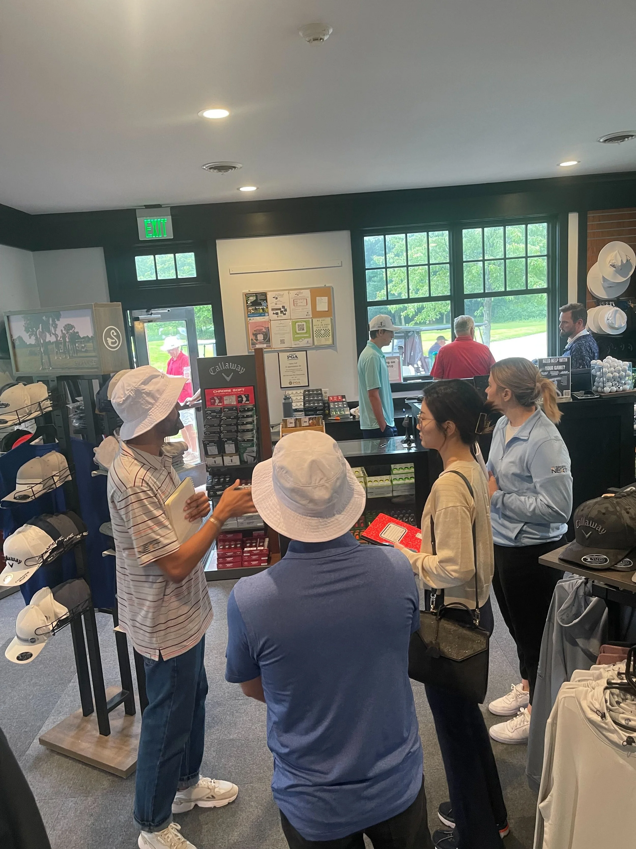
I organized and led multiple contextual inquiry field research studies at golf courses in Orlando, FL, and Minneapolis, MN. Our primary goal was to observe golfers, ask questions, and document our findings.
What We Learned
Most golf courses, including the ones visited, still required members to confirm online check-in at the pro shop to maintain revenue from sales and provide a personal greeting.
Additionally, we learned that while golfers appreciate the convenience of mobile check-in, they find the overall user experience frustrating due to confusing workflows, repetitive screens, payment issues, and the need to visit the pro shop to complete check-in, which detracts from the convenience of using the feature.
Uncovering Pain Points & Establishing a Benchmark
Building on the project goals and insights from field research, I conducted a usability study to thoroughly investigate the challenges in the original mobile check-in. Participants were instructed to complete a tee time reservation and make the payment for that reservation during the online check-in process.
Study Details:
Tool: UserZoom
Quota: 15 participants (golfers)
Study type: Unmoderated usability test (audio and screen were recorded)
What We Learned
The usability study found several problems with the feature's visuals during the check-in process. Participants were confused by the call-to-action on the landing page, often clicking 'Place Order' instead of 'Check-In,' which took them to the wrong screen. Additionally, users found it confusing that they had to manually confirm the number of people they were checking in for. They felt this should be set automatically based on the reservation.
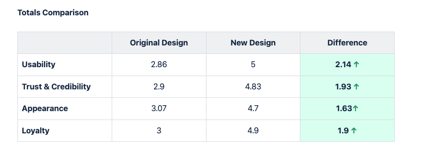
In this initial usability test, I incorporated the SUPR-Q (Standardized User Experience Percentile Rank Questionnaire) to measure the overall quality metrics of the current design. The results served as a benchmark for the design iterations, enabling us to track improvements and identify areas that required further attention
The raw scores range from 1-5 (1 being the lowest score and 5 being the highest score)
Integrating Research Insights for Design Development
Field research and initial usability tests revealed key user behaviors and pain points, helping us pinpoint specific issues and identify improvement areas.
The first round of mockups for the new designs focused on creating a clear visual hierarchy to guide users intuitively through the interface. Using size, color, contrast, and spacing, we highlighted key components like calls to action, improving navigation.
Once the initial design mockups were created, I conducted additional usability tests. The results were positive, with users finding the new design easier to navigate and showing a significant improvement in time-on-task compared to the original.
Original Design
New Design
Streamlining The Booking Process
Throughout the design process, our team focused on streamlining the multiplayer reservation workflow, allowing users to easily reserve tee times for groups. The new design introduced flexible payment options, enabling each player to choose their payment method and offering individual online check-ins with real-time updates to reduce bottlenecks.
To finalize the display of player counts on the reservation screen, I conducted an A/B test with 100 participants to compare two different design concepts.
Design A
Design A performed better in the A/B test, and that was the direction the team decided to go for. Users expressed that they found the design more intuitive and engaging.
Moving forward, we focused on refining this design based on the insights collected, ensuring that we addressed any remaining pain points while amplifying the strengths identified in our tests. Collaboration with the design and development teams were key to seamlessly implement the necessary adjustments.
Design B
User Perceptions and Feature Value Assessment
Alongside the usability and A/B tests, I designed and conducted a product-focused survey to address key questions from our product team, such as golfers’ perceptions of the feature’s convenience, the clarity of its benefits, and anticipated usage frequency. The survey was built on UserZoom as an unmoderated study with a quota of 100 participants who were active golfers.
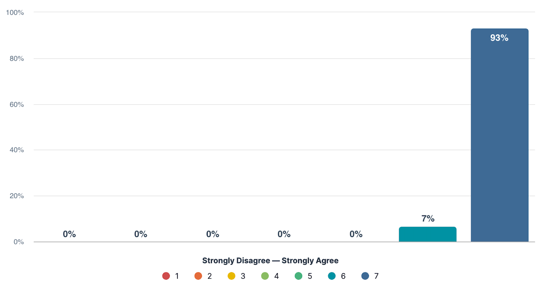
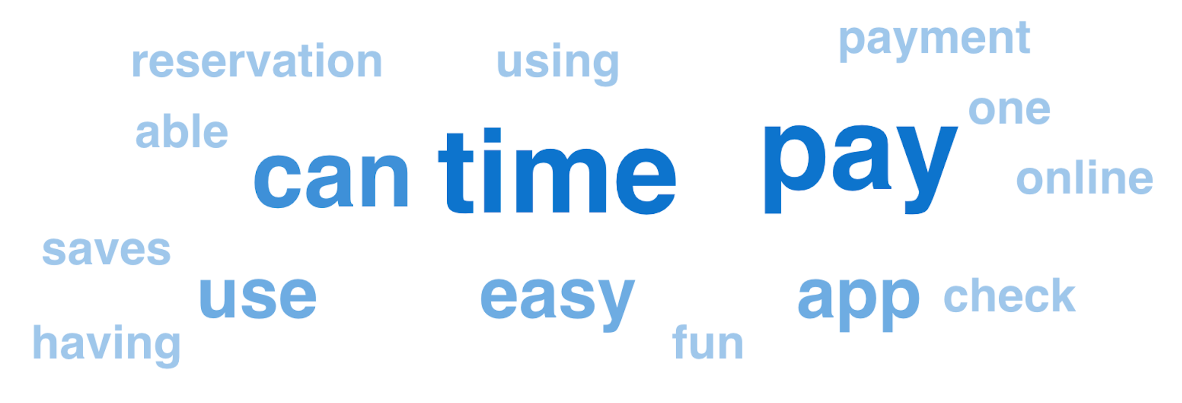
Results confirmed that golfers not only understand the benefits of using mobile check-in but also recognize its value and potential. Participants expressed a strong willingness to use the feature frequently, indicating a high level of desire and demand for this functionality
This feature makes my check-in & payment experience easier or more efficient.
How much do you agree or disagree with this statement?
What are the benefits of using this feature on the days you play golf in terms of convenience?
How frequently would you use this service?
Interviews with Course Operators
Our field research made it clear that the user experience extends well beyond the moment of check-in, encompassing all interactions with course staff up until tee-off. We also recognized that a smooth golfer experience depends on a positive experience for course operators, making it essential for our team to support both sides to ensure seamless overall interactions.
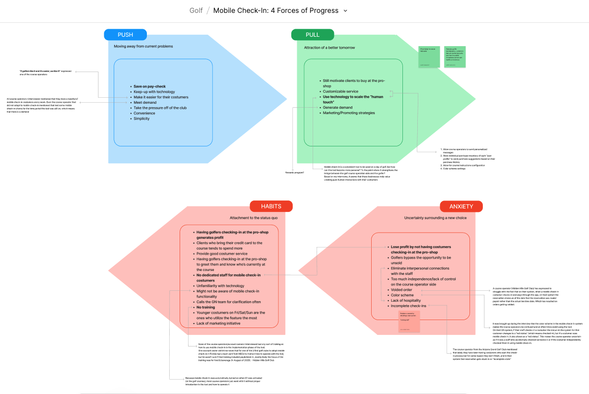
While the designer finalized the design mockups, I conducted in-depth interviews with course operators to understand their challenges with mobile check-in. Using open-ended questions, I gathered insights into both the mobile check-in feature and their overall workflow. These insights were crucial in addressing barriers to adoption and shaping our strategy to motivate courses to embrace the feature. I used the 4 Forces of Progress methodology to effectively communicate the findings to all my stakeholders.
Study details
Tool: Teams meetings (virtually)
Quota: 10 participants (course operators)
Study type: Moderated user interviews. Each session lasted 30 - 45 minutes
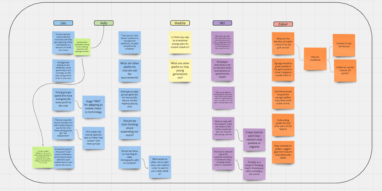
The 4 Forces of Progress artifact I created was key in communicating the factors influencing course operators' decisions about mobile check-in. It highlighted the forces pulling operators away from adoption (habits and anxieties) and those motivating them to embrace it (pushes and pulls). My analysis revealed that operators resisted mobile check-in mainly due to concerns about missed pro shop revenue and a lack of training on the system, leading to frustrations and abandonment of the feature. Additionally, smaller courses value personal greetings, further hindering full adoption.
SOLVING THE COURSE OPERATORS’ CONCERNS
Drawing on the insights and findings from the interviews, my team and I engaged in an intensive brainstorming session to generate ideas on how to help operators overcome their concerns about potential revenue loss, while still ensuring that mobile check-in remains a convenient and valuable feature for both golfers and course operators.
After long brainstorming sessions with all my stakeholders and leadership, the idea of implementing a mobile check-in booth inside the pro-shop emerged. This booth would feature a monitor where users can scan a QR code generated by the app after checking in, allowing them to be ready to play within seconds. This approach ensures:
Users still bypass the line, maintaining the core convenience of the feature
Golfers continue to enter the pro-shop
By scanning a confirmation code and quickly being ready to play, users have more time to enjoy the pro-shop
Course staff still have the opportunity to greet their members
It's a win-win!
Implementation & Business Impact
After finalizing our designs, I conducted an additional round of usability testing to validate the new designs. For these final tests, I gathered insights from over 30 golfers during a two-week testing period.
Benchmarking
By benchmarking our results against those from the original design, we gained a clear view of our progress over time. This approach was instrumental in transforming how we tracked and improved our designs, providing tangible evidence of the impact of our efforts. The steady improvement in ratings from the initial design to the final iteration demonstrated the power of research in crafting products that seamlessly integrate into our customers' lives, ensuring both user satisfaction and business success.
With the outstanding results from the final round of usability tests, combined with the extensive research data collected throughout the project and design cycle, the final designs were approved and successfully launched in 2023.
In addition, we introduced a new and innovative approach to our communication and partnership with course operators.
Since then, the business has achieved significant milestones, including:
+97.2% Unique transacting courses
+86% Golf course adoption
+294.8% Total mobile check-ins
+272.6% Total Charges
Final Designs
Shedding Light On Research
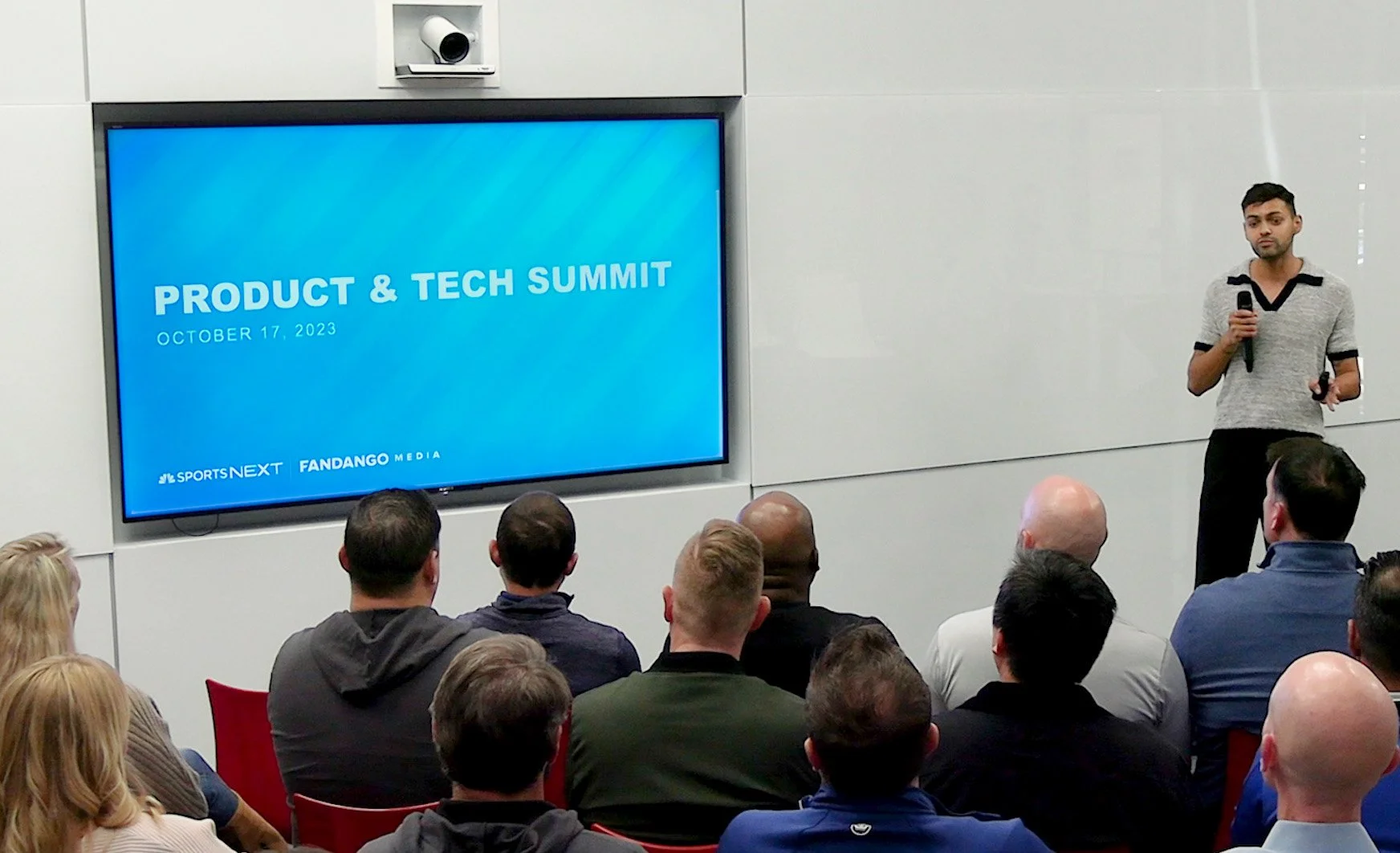
Last year I had the opportunity to shed light on the amazing research work done on mobile check-in at our annual Tech & Product Summit :)
